group project: local business b2b collaboration app
Locale

Overview
A local B2B platform that empowers small and medium-sized enterprises (SMEs) by providing them with comprehensive business analytics and facilitating collaborations within their local community.
Role
User Flows, Wireframing, Prototyping, User Testing
timeline
1 month (October 2023)
Team
3 Designers
1 Digital Marketer
Project goals
What do we want to achieve?
Connect
We want to create an experience where users can connect with like-minded individuals, share their favorite businesses, and contribute to the growth of their local communities.
Explore
Should be able to explore and discover new businesses in their area, leave reviews and recommendations, and support local entrepreneurship.
Community
Should foster a sense of community and support for small businesses while promoting local economies.
research question
As we enter an increasingly digitized society, SMEs (small-medium enterprises) can struggle to compete with their big businesses counterparts. Our investigation of this issue was centered around our key research question:
What obstacles do small businesses encounter in enhancing their visibility within the local community amid the growing influence of digitalization?
Constraints
The Canadian Federation of Independent Businesses [CFIB] completed their own report about this issue from which we extracted three key issues:
1
SMEs lack access to customer data compared to bigger businesses leads to less data-informed product decisions.
2
SMEs get lost in search algorithms which often favor bigger businesses that can afford to pay promotion costs and thus have greater customer reach.
3
SMEs struggle to find a direct line of communication to customers which once again leads to less data-informed product decisions.
To summarize, there is a clear information gap in the current sphere where SMEs don’t have high levels of consumer data and consumers don’t have knowledge of these SMEs. They need a tool that solves those three key issues while fostering a deep connection to their community.

To reiterate, small businesses lack digital visibility, so our user flow focuses on one unique strategy our app offers to increase visibility: streamlined B2B collaboration.
Our analytics and partnership suggestion feature can guide SMEs to building new business connections while expanding their customer base and thus improving overall sales.
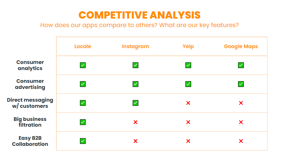
Our key features that we want to point out compared to our competitors include the entire platform itself filtering out big businesses as it only highlights locals and easy B2B collaboration.

Final designs
user testing

Participants (mainly business owners) were selected to interact with the prototype in a proctored environment with recorded audio to extract an accurate transcription for the qualitative analysis. The evaluation focused on tasks involving the exploration of personalized analytics, the recommendation of potential collaborations, using the message feature, and checking the reviews of other businesses. Following the user tasks, six additional follow-up questions were asked for feedback in depth.
Results & interpretation

The interview feedback on the user experience of Locale highlighted a generally positive response to navigation, with users finding it clear and intuitive. The personalized analytics and recommendation feature received high praise from three interviewees, emphasizing its potential for boosting sales and customer engagement. (Note: these are not the real names of the testers, and instead were randomly generator to protect privacy and reduce bias)
However, challenges arose, such as Marie's detour due to a malfunctioning "see all" button. Feedback for improvement included issues with analytics visibility, confusion between the "Home Screen" and the "Analytics page," and suggestions for accessibility features. To address these, I suggested creating an affinity diagram to address these changes. Our team came up with around 15, incorporating valuable insights from the Think-A-Loud user testing phase.

Of course, we wanted to be able to re-iterate out design and implement these 15 actionable changes, but due to the timeframe of this group project we were unable to. Instead we concluded these as long-term changes our application could make moving forwards, if we were ever to continue this project.
final designs

Main Takeaways…
Grouping Methods
I realized how important it was to have regular check-ins and group our thoughts together, to create new & more fleshed out iterations. The techniques used such as affinity diagrams and tagging, made the process a whole lot smoother & organized our thoughts better.
More is not always better
Looking back, I now feel like if we focused more on a niche and narrower pain point, we could've had a more impactful solution or design for the problem statement given. I realized what we were going for was too broad- and trying to solve two really big pain points was going too far, and should have cut it down more.
Proper sleep & balance
No matter how much you want to do well on something, nothing is worth sacrificing your sleep and mental health over. At the end of the day, these events exist to help you grow, learn, and gain something out of it. It's not the end of the world.