sunlife uxperience design-a-thon: pregnancy social support app
Juno

Overview
Won 🥈2nd place in the SunLife uXperience design-a-thon with over 20 teams participating. Iterated high-fidelity prototypes of the mood tracker & algorithm journal entry interfaces for a social support app that creates a safe space for those experiencing pregnancy & postpartum.
Role
UX/UI Designer
timeline
< 1 day
Team
Sasha Takoo, Digital Marketer
Chris Pan, Digital Marketer
Jessica Wu, UX/UI Designer
Zoe Tuseth, UX/UI Designer
Vincent Yu, UX/UI Designer
Problem
1 in 5 Canadian women experience PMHD (prenatal mental health disorders). The healthcare system is failing these women and there is nowhere to go for alternate resources.
Solution
We decided to implement a personalized discussion board crafted through algorithms to help users access multiple resources/opinions. I also implemented an algorithmic journal chatbox for users to record statistics about their pregnancy journey to identify patterns and seek help early.
FINAL RESULTS
UNDERSTANDING THE PROBLEM
The healthcare system is failing these women.
87% of health care providers were not mandated to provide screening for PMHD, over 50% lacked training.
And there is nowhere to go for alternate resources. Survey based research has revealed Canadian women felt that external resources and community-based support is lacking.
Key findings…
Our product features and flow are directly influenced by research shared on the National Library of Medicine on pregnant women’s research strategies and habits. We concluded three main factors:
1. Women highly value other’s experiences.
2. Women want privacy.
3. Women want multiple sources.
ideation
How can we bridge this lack of support?

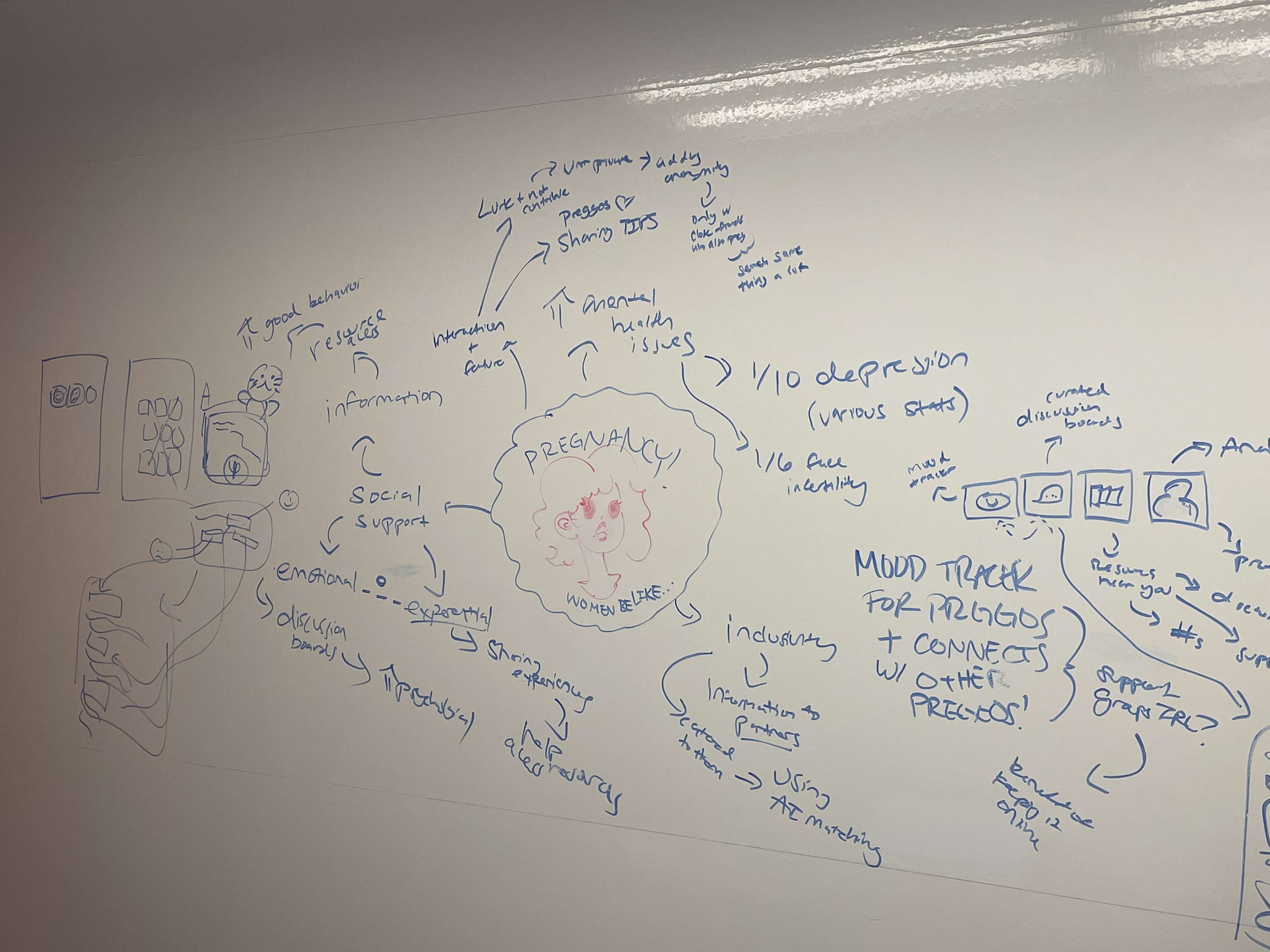
The ideation phase was the most difficult part, especially given our time-constraint. We know we wanted to create a virtual space within Juno where users can empathize with other struggling pregnant women while also giving them an opportunity to learn and grow from their experiences.
Here's what we came up with and narrowed down to during this phase:
Mood tracker to identify patterns and record statistics
….
Curated discussion board with anecdotal evidence and tips
Local community-based and national resources
However, we felt there would be a disconnect in user flow with the way the features/ideas we narrowed down to. Right now, it just felt like a social media platform with a mood tracker & resources page just thrown in. We either had to change or take away one of our ideas or present a new feature that helped seamlessly connect the existing ones.
Mood tracker to identify patterns and record statistics
Algorithm-based AI journal entry chatbox
Curated discussion board with anecdotal evidence and tips
Local community-based and national resources
After some more brainstorming, I suggested implementing an algorithm-based journal entry for users to vent their thoughts & frustrations in the mood tracker flow. The algorithm would then utilize AI to analyze keywords and context clues as data for the curation of the personalized discussion board.
For example, after the user completes their journal entry, the chat box could then analyze specific frustration, and the personalized discussion board will then show posts or other users experiencing that same frustration. This also records qualitative data for the mood tracker for identifying patterns as well. Thus, we concluded this would be a relevant feature to implement, as it allows for a more seamless, cohesive user experience for Juno.
KEY FEATURES
What was the final implementation?
Landing Page & Profile
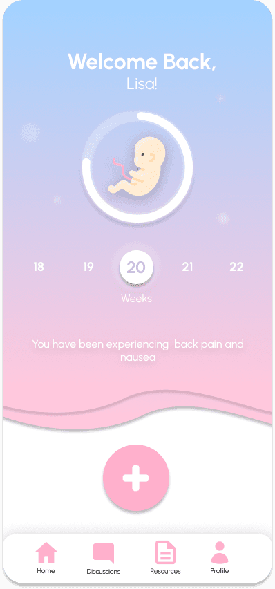
Here, the user has a week-by-week tracker where they can see how far along they are with their pregnancy, along with logs of their mental health progress & experiences.
The profile will also track the user's analytics regarding their moods & symptoms in their most recent week.


Daily Entry: Mood Tracking & Journaling
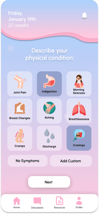
With a tap of the plus, you can add a daily entry: where the user can log their feelings, physical symptoms, and any additional comments or topics they want to vent. After submission, the algorithm will analyze their entry and take into these 3 criteria, as well as keywords to curate data for the personalized discussion posts and resources, in the next flow.


Discussion Board & Resources
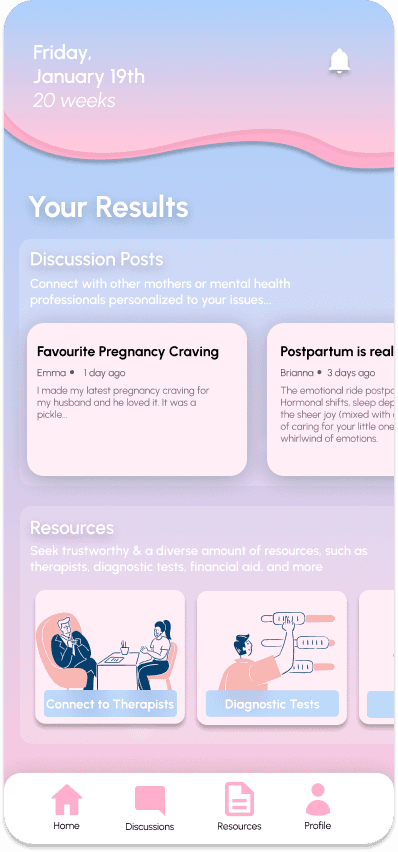
The discussion board connects with other pregnant or postpartum womens, where our users can access support and also anecdotal evidence to make them feel less alone with their experiences. With Juno, users gain a sense of confidence and understanding with multiple resources and opinions.
The resource page connects the users with verified external resources that are both community-based and national. Key resources to highlight are Financial Aid, Connect to Mental Health Professionals, and Diagnostic Tests.


RESULTS
Finally…

After an intense 8 hours, our team Juno emerged as a promising solution (2nd place) to address the pressing issues surrounding women's mental health in Canada, specifically PMHD. Our collaborative efforts resulted in a user-centric platform that prioritizes accessibility, privacy, and community support.
Despite many challenges and arguments, I was proud nonetheless since those obstacles were necessary for everyone on the team to try their hardest. We aimed to empower pregnant individuals and new parents to navigate their journey with confidence, providing invaluable resources and a nurturing online community.
CHALLENGES & TAKEAWAYS
What could have been better?
Communication
We found ourselves spending a lot of time debating/conflicting on certain features. While conflict is necessary, given our time-constraint it was not the best use of our time. We figured out most of what we were arguing about was the same idea, but told differently- this is where activities like whiteboarding and mind-maps were useful.
Storyline
One technique we could have implemented in our presentation was a storyline. Again, considering the time constraint it is not a priority, however spotlighting a specific user target and creating a detailed storyline could have created a stronger impact when presenting.
Proper Design System
Our design iterations could have been better with a proper design system. A lot of the workload was spent too excessively on branding, colour palette, and typography sizing when that could have been coordinated at the start.